Friday, 28 February 2014

EXAMPLES OF FORCED PERSPECTIVE


BRAINDEAD (Peter Jackson, 1992)


Peter Jackson's third film - and easily my favourite - was this peerless splatter comedy. The effects were handled by Richard Taylor (who, as founder and head of Weta Workshop, still handles the effects in Jackson's movies); they were realised with typical 'kiwi ingenuity,' and include examples of most traditional in-camera techniques - including forced perspective, which was notably used in shots of the (supposedly) huge 'Mum-monster' in the final. She is placed nearer the camera, on scaled-down sections of the set, to increase her on-screen size. 
The above shot, where the protagonists appear in the foreground, has (I think) been carefully arranged to give the illusion that the monster is further from the camera than she really is.


THE LORD OF THE RINGS (Peter Jackson, again. 2001-03)


Forced perspective was one of the in-camera techniques used in the Lord of the Rings series to make the hobbits look small. Above is an example, where the actors are sitting in differently scaled halves of a cart - one positioned nearer to the camera. You can see how important the direction of the actors's gaze is in maintaining the illusion.

For the Lord of the Rings, a more advanced forced-perspective technique was also developed. Forced-perspective exploits the static position of a single lens to create its illusion. Having two eyes is one of the ways we are able to gauge distance (a 3D camera is essentially two cameras - or two lenses, at least - placed side-by-side at a distance equivalent to that of human eyes). So, everything has to line up; if you move the camera to one side or the other, you break the illusion. To allow for moving shots, whilst still maintaining the forced-perspective illusion, the differently scaled sections of the set were built on moving platforms, which could moved precisely according to the movement of the camera.


THE BEAST FROM THE EGG (The Chiodo Brothers. Don't know when)

The Chiodo Brothers are not a big name in the effects industry - probably best known for Killer Klowns from Outer Space (which does use some forced-perspective I think...) But anyway, this is an early production of theirs. Very early. And its interesting because it uses not only forced perspective but also pixilation as a low-tech way for the human stars to interact with their stop-motion-animated, forced-perspectivicated foe.


Saturday, 18 January 2014

METZ - FOREST


It was voted 'scariest ad of all time,' and graced our screens, it seemed, mostly late at night. Not a few complaints were received from concerned parents, and so it was deemed 'too scary for television' (whatever that means), and shortly after banned.

Back in 2000, Bacardi's Forest advert took us to a darkly theatrical fairytale world, inhabited by the wonderfully creepy 'Judderman' - who would lure unsuspecting travellers into unspecified danger with his Schnapps-based alcopop drink. Taking his name from the 'judders' which were an effect of drinking Metz, and a focus of the advertising campaign, he was designed to be beguiling, mysterious, and cold - just like the drink.
The intention was to bring an element of danger to the product. (As HHCL & Partners creative Al Young explained, 'If your're over 18 and you have a choice between a safe product and a dangerous one, you'll choose the dangerous one.')


The inspiration for the style came from early cinematic classics like Nosferatu, and the works of Czech animator Jan Svankmajer. An adapted hand-cranked camera was used, to replicate the variable shutter speeds of early cinema; dissolve effects were achieved by taking double exposures.
It was shot in Budapest, on a gorgeous icy set that had been created for a recent film. The Judderman himself was played by a 6ft-5 ballet dancer, lending him the eerie, elfin movement they wanted. Traditional puppetry and animation add some nice touches, and the whole is completed by a voice-over by Polish-Czech actress Alicia Suszka Fielder.

Metz has has been discontinued, so perhaps as one review suggested, this was a case of the advert overshadowing the product. Which I guess would raise the question, can an advert be too good?

Sunday, 24 November 2013

IN THE FIRST PERSON
Filming in the first person - or 'point of view' (POV) filming - is one of the foundations of editing taken in its broadest sense. Many, many shots in a film are showing us events (or details) from the perspective of one or more of the characters. In this project, however, we were practicing more what I suppose you could call 'inherently point-of-view filming: shots which, even without the context of the editing, are obviously showing us the viewpoint of a particular character. The kind of shots which are used most often in horror/slasher/thriller movies.
Stanley Kubrick gettin' some tasty POV

The POV shot can create a very intimate style (often uncomfortably so), and is obviously quite immersive for the viewer - placing him/her in the thick of the action. But its popularity in genera movies lies in the fact that its a very simple way of showing viewers the action whilst concealing 'something' - a character whose identity we wish to remain hidden; a monster whose exciting and original appearance we're saving for the final (or more often, whose underwhelming and ropey appearance does not bare extensive screen time), etc, etc.
For this college experiment I and my group chose the horror/slasher genera (of course). We found a great location in the glass-tunnel overpasses on Union Street (Plymouth). I gave the 'killer' yellow washing-up gloves (a rather cleaver joke-reference to Giallo) and made sure the last shots of my character being strangled were sufficiently lurid. The 'tongue-out' thing was pinched from Polanski (who I think pinched it from Hitchcock) - for me its grotesque and darkly comic. The idea of the killer painting a number '9' in ketchup didn't quite come off, but I added a lovely retro red tint to the final shots which I feel successfully distract from this point.


I  added scratches to the film and a soundtrack composed of many, many fragments (we didn't record use-able sound on location); it was designed to sound like a low-budget, 70s horror.
Filming in first-person is a great way to skimp on things like costuming, choreographing, actor presence, special effects (if it were a monster movie), etc...

Saturday, 5 October 2013

3 SCENES


ZOMBIE FLESH-EATERS - 'EYE-POPPING SCENE'
 
Lucio Fulci is a great director of explicit gore films, characterised by little in the way of coherent plot and - perhaps merely as a result of this - a nicely surreal vibe. His films are what I would call 'elevated trash.'

 
Zombie Flesh-Eaters (aka Zombi 2) is my favourite, for its atmospheric setting, memorably haunting score and numerous visually and conceptually striking scenes.
This one I've chosen is Fulci at his best.
 
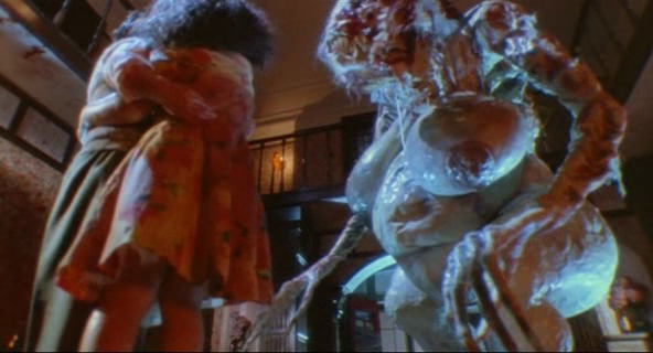
An attractive woman is taking a shower - he has our attention. She is not so alone as she thinks.
We follow her in a single medium-long shot - no cut-aways, no close-ups - as she is alerted to impending danger by way of exaggerated and rather ambiguous sounds from outside. Or so we assume. But when she retreats to another room and goes to shut the door, it is stopped. The intruder, it now seems, was inside all the time...


We focus, quite brilliantly, on the growing band of light cast on the wall as the door inches open, despite her efforts to close it. 
The entire scene is shot in a simple, pared-down style, far more effective to my mind than the over-wrought style of most modern horror. By this point we're closer to the action and there are more cuts - but still comparatively few separate shots; the lighting is plain, natural in effect; music consists of little more than a few screeching notes, and the soundtrack is instead dominated by the loud and stylised sound effects - the groaning and creaking of the door as the woman fights to close it; the juicy crunching of rotting knuckles; the splitting and splintering of wood...
 
And what follows is one of Fulci's trademarks - a scene of alternating point-of-view shots, and an endlessly-approaching pointy thing - structured and drawn out in such a way as not only to create tension, but also to give us hope. Hope that the Woman will escape her situation at the last moment.
But instead, we're subjected to a pornographically close-up view of her decidedly not escaping. And to her animal-like screams.
 
 
An assault on the eye - both of subject and viewer.
 
 
 *  *  *
 
BAD TASTE - 'DEREK'S FALL'
 
I chose this scene because its an interestingly complex one to have filmed - in this case, literally, with a single camera.
 
 
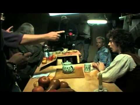
Peter Jackson's first film was a shoestring splatter-comedy made with a group of friends over four years of weekends. Jackson was director, special-effects technician, camera-operator, and actor. And in this scene he plays both roles - Derek (with false buck-teeth - made by Jackson - and automatic weapon - made by Jackson) and Robert, a retarded alien (with beard - grown by Jackson.)
 
 
Carefully edited together from shots taken months apart, he is able to fight himself - and both wins, and loses.
Filming on a cliff - which apparently never looked as dangerous on film as it did in real life - they employed home-made wooden tracks and camera-crane cobbled together from aluminium rods. The camera was a second-hand Bolex, capable of shooting 30 second bursts of film, once you wound it up. Construction of the crane made it impossible to look through the viewfinder, so they were simply pointing the camera in the general direction of the action. It works fine.
(They had no sound equipment, and so all sound was recorded separately.)


The editing - like everything else in the film - is very impressive when you consider what was achieved under the circumstances. Continuity is not lost (unless you count the shoe flying off the dummy's foot during the fall, to reappear in the final shot). The accidental breaking of the dummy in the mid-section adds to the illusion. And the fact that a bucket of blood is visibly chucked over the dummy from out of shot at the end adds to the home-spun charm.
 
 
*  *  *
 
CARNOSAUR - 'T. REX VS. BOBCAT'
 
Well, my other reviews have been positive, so I felt like a change of pace.
Carnosaur is a 50s style b-movie with a 90s attitude, produced by Roger Corman to coincide with the release of Jurassic Park, and cash in on the hype.

 
Now I mentioned in a previous post that I rather like Carnosaur. I like it because I enjoy big ideas done cheap; it's dark, nasty, has some comically shady government goings-on, and a ludicrous story involving a plot to wipe out mankind by means of a genetically engineered virus that causes the world's female population to die whilst giving birth to baby dinosaurs.
But it is certainly a bad film. And it has some mesmerizingly awful dinosaurs, created by John Carl Buechler.
The final scene, which I've chosen for its representative badness, is a rip-off of the finals of Aliens, and of a lesser-known 1960 film called Dinosaurus! (As Director Adam Simon said, 'if you don't want to be accused of ripping off a movie, you rip off 10.')
 
 
Corman said he hated stop-motion (probably because it takes time and money) and he hated optical effects. So all the dinosaurs were live action beasts. The T. rex is played by three different models - a 16ft-tall pneumatic (and rather static) creature; a 7ft-tall man-in-a-suit version, and a mechanical 3ft model with the ability to walk. Kind of. (The movements of all the dinosaurs are stiff, and strangely uncontrolled.)
The smallest T.rex is often integrated by means of forced-perspective, with variously unsuccessful results. The 'miniature action' involved a Bobcat made from styrene and card, and a camera on a skateboard was used for the 'driver's P.O.V.' shots.

  
The thing is, I love this low-tech, 'pull-it-out-your-bum' style of film-making. But I have to admit, the result here is a little embarrassing. The scene is poorly edited. The use of a lot of quick cuts does nothing to help the illusion that a fierce battle of life and death is taking place. The action is repetitive. The synthesised score is cheap and generic, and the dinosaur sound-effects are unrealistic and non-threatening.
But what a one-liner at the end...

Wednesday, 2 October 2013

ON RIPPING-OFF

So how, I'm sure you're all eager to know, do I feel about copying other people's work?
Well, this is a complicated issue. I think that what hurts is the thought of someone else taking credit for your idea - your little stroke of genius. But that assumes that the other person - the copycat - had more success or recognition for the idea than you yourself had.
I doubt that Steven Spielberg's sense of identity was much dented by an obscure Roger Corman film called Carnosaur, whipped up and released before Jurassic Park was ready to change the world.


Of course I naturally identify with the little people on this matter. And its not just about whether or not, in fact, plagiarism took place. I know how it can hurt to find that someone, somewhere, has stolen your idea before you'd even so much as voiced it - let alone realised it.

But it's also true that imitation can be taken as a compliment.

Case in point: Zombies.


Zombies are a huge part of popular culture. The Zombie movie is one of the most over-crowded sub-genera; there are well-attended annual Zombie marches in many places in the world; the Zombie Apocalypse is a deeply embedded idea - an alternative reality in popular imagination.
But the Zombie of modern popular culture is the creation of one man - George A. Romero.


Before Night of the Living Dead (1968) there were relatively few films featuring Zombies - and they were invariably the traditional Zombies of Voodoo folklore.
Is Mr Romero pissed? Does it annoy him that he's lost control of this creation in such an epic way? Well, actually, I wasn't able to find out. But I doubt it, at least by now. Everyone has heard of Night of the Living Dead, he's recognised as the father of the genera, and he's done very well out of it - the ever growing popularity of Zombies has allowed him to continue making films in the genera even to the present time. I suspect he is rather proud.

In truth, there is nothing new under the sun. I'm always creating in my mind, and of course my ideas are heavily influenced by the things I like. I notice what I find effective, and I copy.
Stephen King said that a new idea is usually just two old ideas put together for the first time.
I think that's true. Or sometimes they are simply stripped back - the basis for a popular idea can be pulled from beneath the mounting piles of self-propagating and increasingly divergent cliché. You can go back to source, and from there spring out in a different direction.
Then there's preconceived ideas that turned out to be wrong - seeds planted by misleading trailers or misinterpreted write-ups.
And finally there's dreams. Especially useful in the case of horror - your subconscious knows best how to scare you.
But of course, these dream images were themselves probably influenced by things absorbed while awake - the ideas of others. It is all but impossible to create something that cannot be likened to something else, by someone else, somewhere.

I've also thought a lot about the fine line between homage and rip-off. The definition lies, I think, in how closely you imitate, and to what effect. For example: in Paul, when we realise that the final scene will take place beneath the Devil's Tower in Arizona. This is loving homage to Close Encounters of the Third Kind.


We see the tower in a single shot, and are then left to forget about it. Its iconic image is not used to enhance the final scenes of the film. It is homage only.

Then again, I'm not saying that in never okay to steal outright. What about if an idea was wasted the first time around? Is it fair game?
And besides, even blatant rip-offs - while most are simply embarrassing - can be fun.
Personally, I enjoyed Carnosaur.

Saturday, 28 September 2013


VERTICAL PIXILATION PROPS


'Vertical pixilation' means shot from the ceiling down, the actors (or human puppets) laying on the floor. This McDonald’s Slaughterhouse and Great Wall of China, which I made as 2-dimensional cut-outs, cobbled together from various photographic elements, were intended to be incorporated into a college vertical pixilation project by the magic of forced-perspective. Unfortunately they were dropped due to time shortage.


Tuesday, 17 September 2013

TURNTABLE ANIMATION
A very old technique. I chose a rotating skull as my subject. I started with lots of test-sketches and workings-out on a piece of paper, and realised after a while that it was probably a bit ambitious. But I'm very pleased with how it turned out.